On a call recently with the CEO of a real estate investing platform, he mentioned one strategy they had been looking at for raising institutional capital. Rather than fight for attention in the most crowded parts of the market, look at particular regions of the country that the bigger and mega funds tend to overlook entirely.
Out of respect for the conversation I will not say where. But it made me curious about how that idea reflects on boots on the ground, so we went to our own data.
What we mapped
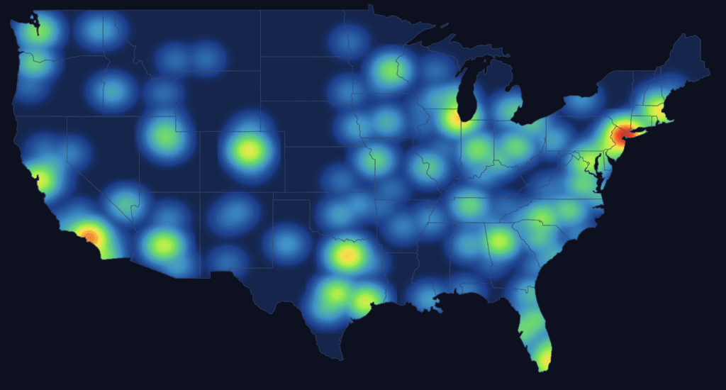
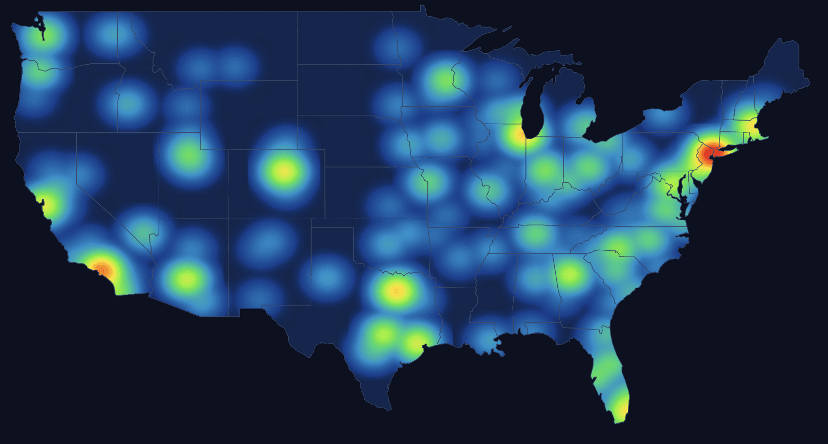
Pulling together our mapping of more than 4,000 US real estate capital formation and investor relations professionals, we built a heat map. All the observations that follow are Francis King data from that map. It covers every level, from head of function down to analyst. It covers every LP type. And it includes both fundraising and investor relations, because in a lot of firms the same people do both.
What it shows
There were no massive surprises about where the concentration is. New York, the North East corridor, Chicago, Texas, Southern California and Florida light up exactly as you would expect.
What was more interesting was the negative space. The Pacific Northwest is almost entirely dark. Not thin. Dark. The Upper Midwest, the Northern Plains and large parts of the South outside Florida look like areas served by people who have to get on a plane. There is coverage, but it originates somewhere else.
The Pacific Northwest example is the one that stayed with me
Take Washington State. The Washington State Investment Board reported total assets of $233.9 billion as at 31 March 2026, including $34.0 billion in real estate, or 14.5 percent of the portfolio, plus a further $13.0 billion in tangible assets. That is one allocator, in Olympia, with a real estate book larger than the entire annual global fundraise of most strategies.
Nobody is suggesting WSIB is under covered. An allocator that size gets plenty of attention. The point is the other side of it. If that is the anchor in a region that shows almost no resident capital raising presence, everything below the very largest allocators in that region is being covered remotely, if at all.
Why coverage sits where it sits
The heat map is really a map of GP offices, not LP money. Capital raisers cluster where the funds are headquartered, because that is where the jobs are. LPs are distributed on an entirely different logic, following state pension systems, university endowments, insurance companies, regional foundations and family wealth. Those two distributions do not overlap neatly.
That gap is the white space. Where there are LPs with real capacity and no resident coverage, a local presence should be worth something. Especially with smaller allocators, who tend to get less attention and who often value the manager who turns up in person more than the mega fund does.
Why this matters more now
Concentration is the reason. Preqin’s real estate report for 2026 found that the ten largest funds raised 53 percent of all capital in the first three quarters of 2025, up from 33 percent in 2024, and that the top ten took 87 percent more capital than the previous year’s top ten. If you are not one of those funds, competing head on for the same crowded institutional relationships is a difficult trade. Geographic differentiation is one of the few forms of differentiation that is genuinely available to a smaller manager, and it is cheap relative to the alternatives.
Meanwhile the Hodes Weill and Cornell 2025 Allocations Monitor found institutions under allocated to real estate by 90 basis points, up from 60 basis points the previous year, with sentiment improving. There is a gap to be filled. The question is who gets in front of it first.
What I do not have
I should be straight about the limits of this. What I do not have access to is the LP heat map. I assume there would be a strong reflection between where LPs sit and where coverage sits, but I cannot prove it from our data. My suspicion is that the correlation is decent at the top end, where the biggest allocators pull coverage towards them regardless of geography, and much weaker further down, where smaller LPs may not get as much love. That is a hypothesis, not a finding.
If anyone reading this has the LP side of the picture and wants to overlay it, I would be very interested in the result.
Practical takeaways
For GPs
- Before you hire another capital raiser into New York, ask what your coverage map looks like against your target LP map. They are probably not the same shape.
- If your strategy has a regional story, a resident capital raiser in that region is a credibility argument as well as a coverage one.
- Smaller allocators outside the main hubs are the most likely place to find a differentiated relationship, and the least likely place to find a competitor sitting in the lobby.
For capital raisers
- If you live outside the main hubs, that is a commercial argument, not an obstacle. Build the LP list within driving distance and take it to market with you.
- Coverage of a thin region is defensible in a way that coverage of New York is not.
The most useful question a smaller GP can ask right now is not how to compete with the mega funds. It is where the mega funds are not bothering to go.
Mapping the US real estate capital formation and IR market is the core of what Francis King does, and the geographic picture is one of the more useful outputs of it. If you would like to see how the map looks for a specific region or LP channel, email me at j.reeves@francis-king.com.